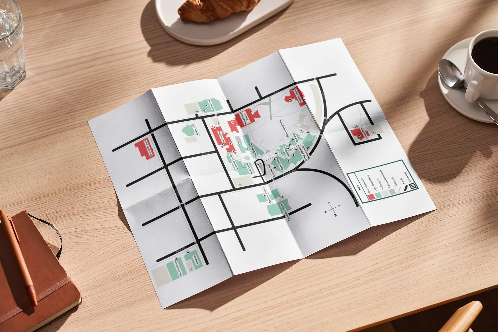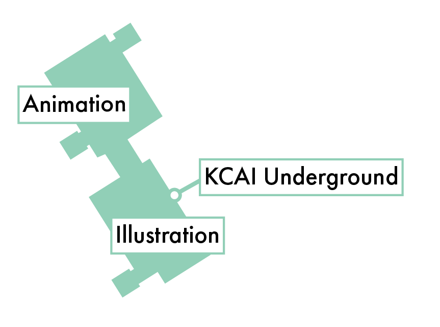

KCAI Accessibility Map
In this collaborative data visualization project, the goal was to give insight on which campus buildings were more accessible than others. Through color coding and icons, we were able to communicate where it would be easiest for students to plan a route to fit their needs.